
When planning a social media marketing strategy, a lot of thought goes into the type of content you will be sharing, but are you also considering what colour palette’s are being used? Not every social media post will have a company’s product—so thinking about the colour palette of your overall branding on social media is important.
Colour plays an emotional connection in everything we do in our lives, and it’s an effective way of non-verbal communication. It is the visual component people remember most about a brand and it gives instant recognition.
“Color increases brand recognition by up to 80 percent.” – Colorcom
Choosing the right colours can be the difference for your business to stand out. Different colours can evoke certain moods and emotions depending on a number of factors, such as culture, gender, age and individual experiences, but the basic perceptions remain consistent.
Remember that your colour palette shouldn’t consist of random colours and it’s necessary to think about several things: colour harmony, which colours best represent the core values of your company, understand your target audience, and how to use these colours strategically to tell your company’s ‘story’ in a visual representation.
We wanted to share 4 different colour palettes we created to inspire you to develop a strong brand presence. To create these colour palettes, we used a tool called Coolors, but there are many others available for you to try, like Canva Color Palettes and Colour Calculator.
Monochrome
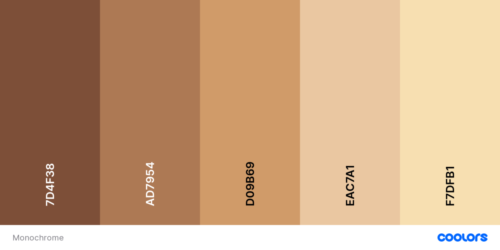
Monochromatic palettes use the same tone of one hue. A one-colour palette creates a harmonious, visually cohesive look and it’s the easiest way to help associate your brand with a specific and memorable colour. It also makes it simple for the process of creating a palette, since you pick one main colour and use variations of it adding brightness and darkness.
“Instead of making your design even busier and confusing with a lot of colors, a one-color palette can help make a layout look cleaner and more organized.” – Canva
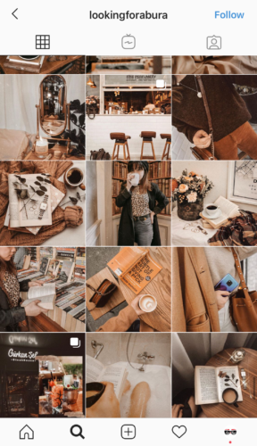
Here’s an example of an influencer using the monochrome palette:
Complementary
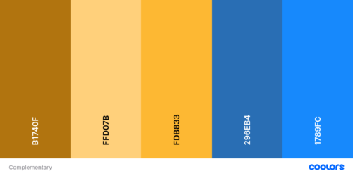
Complementary palettes use colours that are opposite each other on the colour wheel, so it often includes both warm and cool colours. It creates more dimension and balance with a high contrast combination.
“Simultaneous contrast occurs due to a natural illusion when you place two complementary colors next to one another. Both colors will appear brighter and grab a viewer’s attention.” – The Spruce Crafts
Here’s an example of an influencer using the complementary palette:

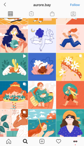
Analogous
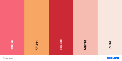
Analogous palettes involve colours that sit next to each other on the colour wheel. They are related and create a pleasing and relaxing feeling. They usually include all cool or all warm colours and it helps keep your design consistent.
“Analogous colour schemes are often found in nature and are harmonious and pleasing to the eye.” – UX Planet
Here’s an example of an artist using the analogous palette:
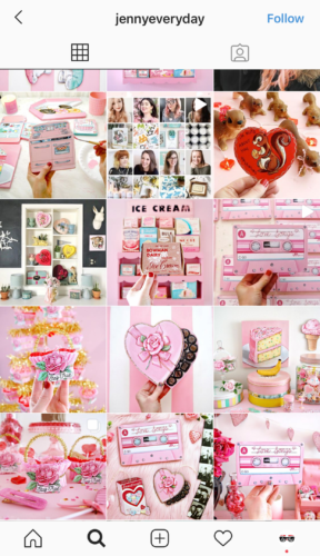
Triadic
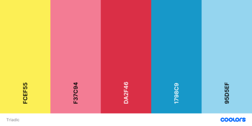
Triadic palettes include three colours that are evenly spaced on the colour wheel. They create a bold and vibrant palette—so it’s important that the colours are carefully balanced, letting one colour dominate and use the two other for accent.
“Because of the strong contrast, a triadic palette is generally quite dramatic.” – The Spruce
Here’s an example of an artist using the triadic palette:
Colour has the ability to evoke emotions in people which impacts their behaviour. When you choose the right colours and ensure that your colour scheme is being carried consistently and coherently across your channels, you’re strengthening your identity in the eye of the audience creating powerful brand recognition. Consistency is vital to ensure your brand has a coherent voice.
A colour wheel is a powerful tool when developing a stand-out colour palette for your business. Try some combinations and choose the one that best represents your brand!
Need more help planning your online marketing strategy? Contact us today to set up a FREE discovery session with our team – we’d love to help!
Don’t want to miss any of our awesome content? Then subscribe to our newsletter below. We will only email you once a MONTH, we promise!